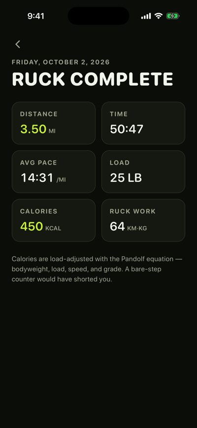
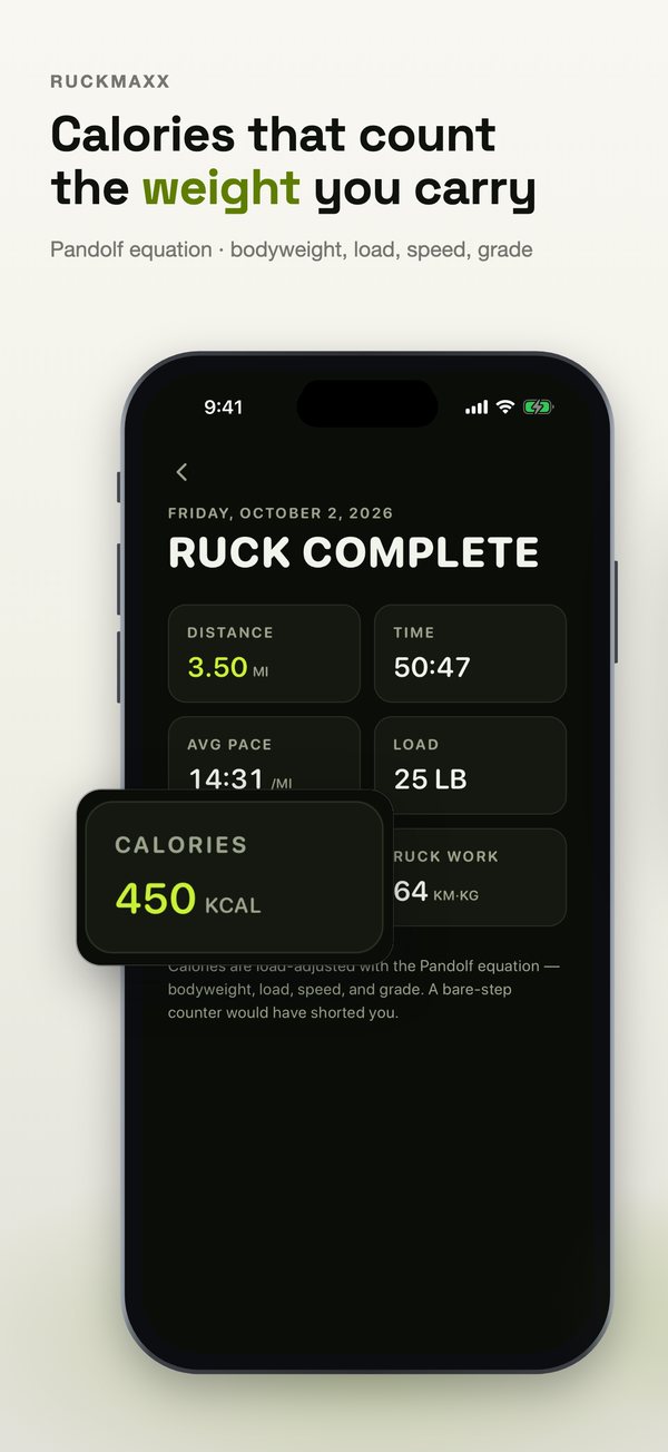
Health & FitnessRuckMaxx“Calories that count the weight you carry”
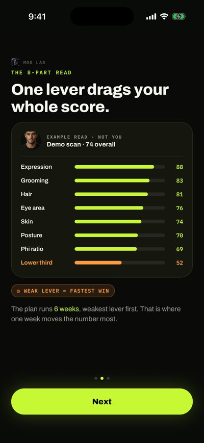
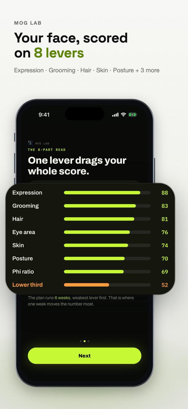
LifestyleMog Lab“Your face, scored on 8 levers”
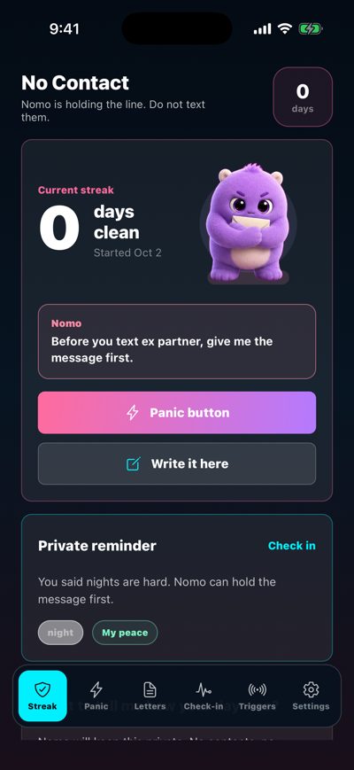
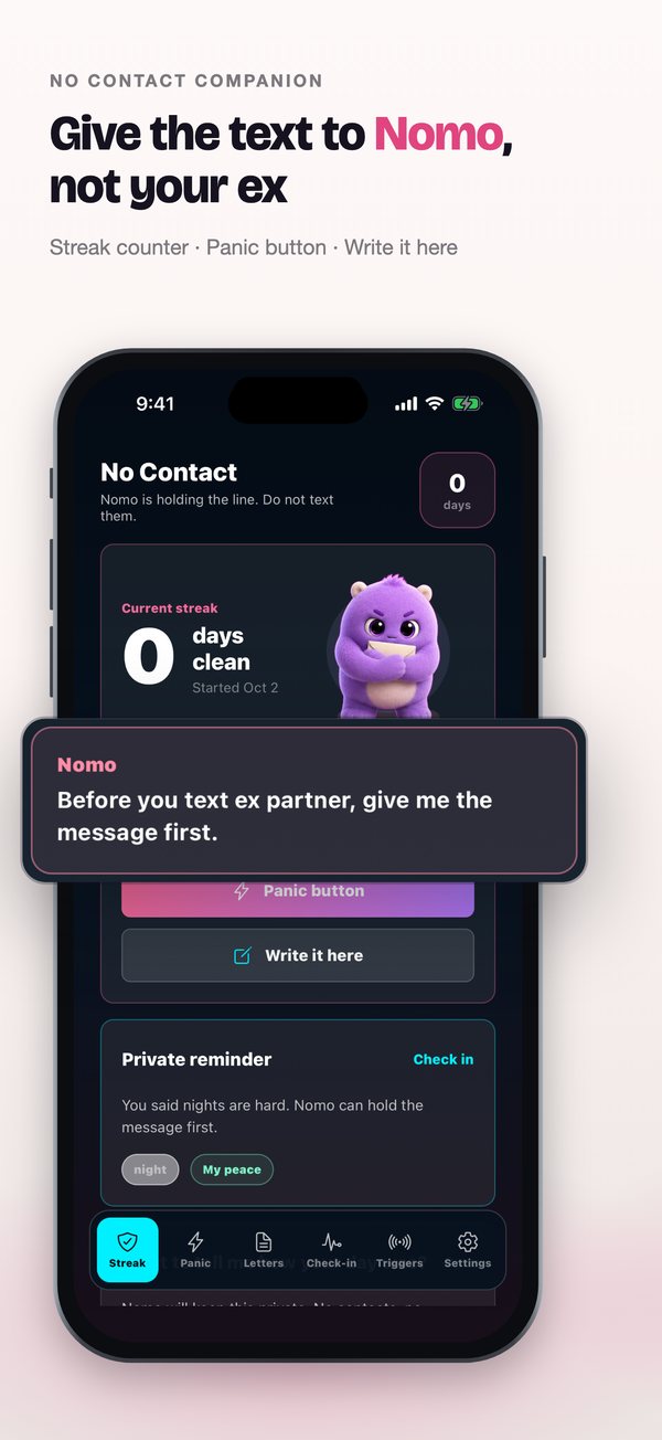
Health & FitnessNo Contact Companion“Give the text to Nomo, not your ex”
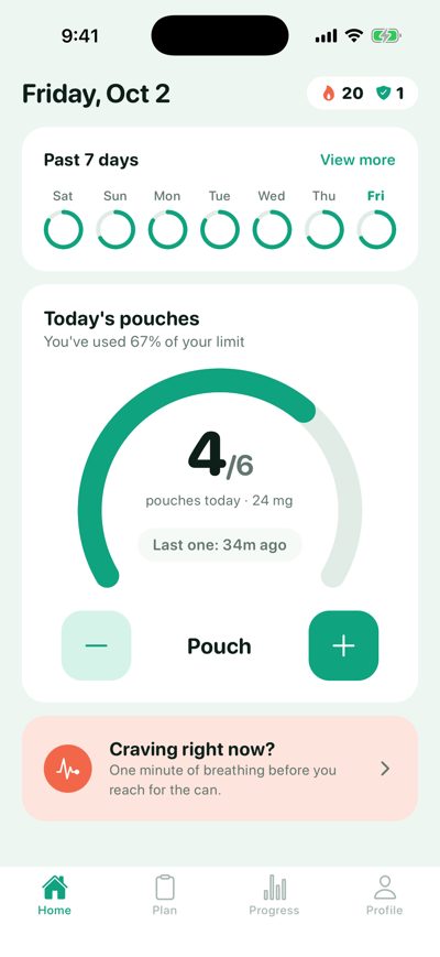
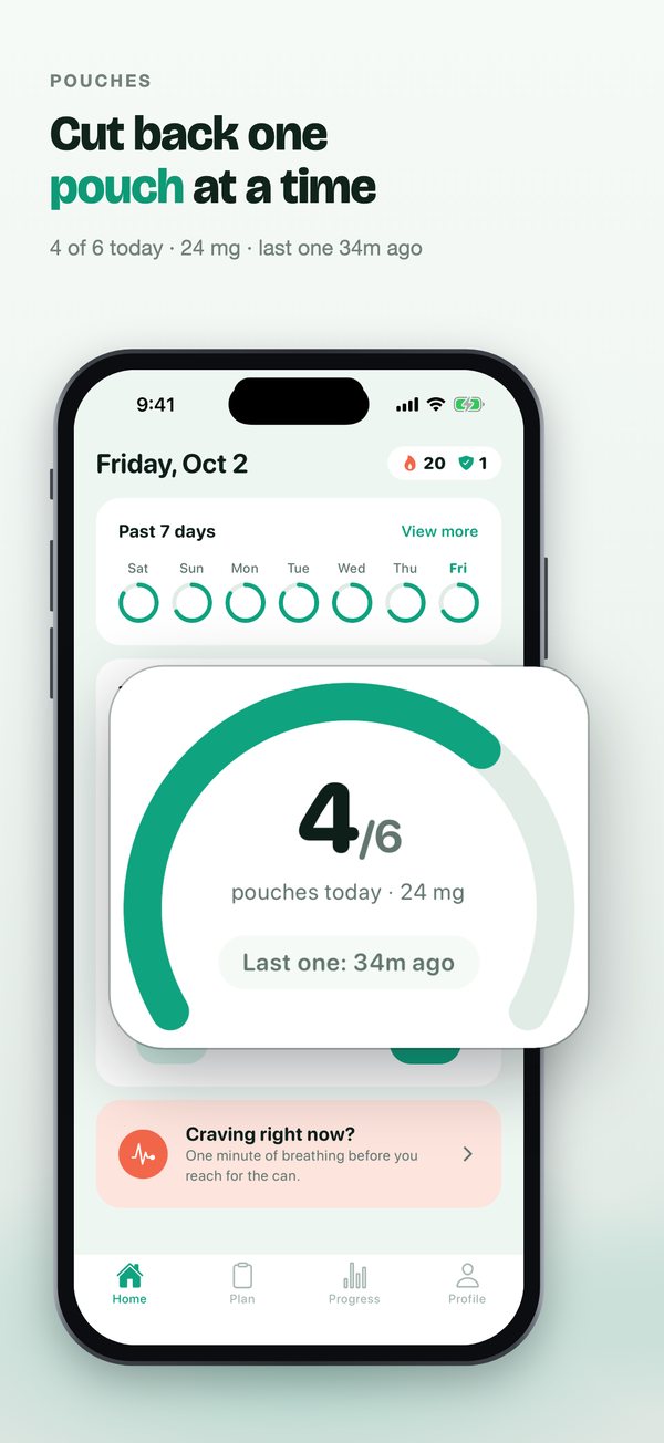
Health & FitnessPouches“Cut back one pouch at a time”
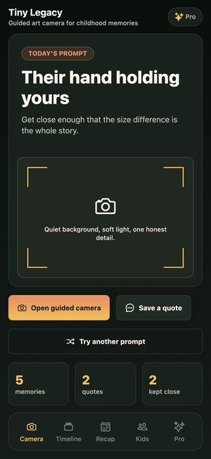

LifestyleTiny Legacy“Keep the childhood the camera roll forgets”
What the after sets have in common
- An order, not a camera roll. The strongest outcome opens the set; onboarding screens and start buttons move to the back or become the closing call to action.
- One claim per slide, from real numbers. Headlines quote the app’s own data (450 kcal, 7.5% a week, $41.10 saved) instead of adjectives.
- Close-ups of the UI that proves it. The card or row behind each claim is lifted out of the screen and enlarged, so it reads at App Store thumbnail size.
- The app’s own colors. The palette comes from the screenshots, so the listing and the app feel like one product.
Why it matters: the first three screenshots are visible in search results before anyone opens your page, and on Apple Search Ads they are the whole ad. See what the evidence says about screenshots and conversion.